The I Ching and technical analysis tools
There are many tools used in technical analysis, all of which take into consideration the YANG/YIN cycle. These tools will tell the investor the position of the market, the industry or a stock within the YANG/YIN side of the cycle. These tools will also tell the investor if the stock he is interested in is on the YIN side so that he may start buying or if it is on the YANG side so that he may start selling. For the investor to follow them closely will make him a better investor, but first he must accept the fact that he must buy at the end of YIN and sell at the end YANG. Most investors have been taught by the major investment houses to buy and hold. But this strategy goes against the very same principle of the seasonality of the TAO.
Many Web sites, including Microsoft Investor, have great charts to make it easy for the investors to follow the MACD.
There are a number of basic charts that could easily point to us this position:
1) Moving Average
- Buy the YIN – when the short – term average moves above the long – term average.
- Sell the YANG – when the short – term average is below the long – term average.
In Microsoft Investor the Moving Average is defined as:
The average price of a security over the previous days or years. For example, a 50-day moving average is the average price of a security over the past 50 days. This gives an indication of a security’s price trend.
For technical analysts, a 200-day moving average is a standard longer term measure, and often this is compared with a 50-day or even 5-day moving average in an effort to gain insight into the direction of a stock. When the short-term average moves above the long-term average, it’s considered a buy signal. When the short-term average is below the long-term average, it’s considered time to get out.
2) Moving Average Convergence Divergence (MACD).
- Buy the YIN – when the MACD crosses above the trigger line
- Sell the YANG – When the MACD crosses below the trigger line
In Microsoft Investor the MACD is defined as a:
Technical indicator developed by Gerald Appel that signals overbought and oversold conditions by measuring the intensity of public sentiment. The Moving Average Convergence/Divergence (MACD) indicator is created by calculating the difference between two exponential moving averages. A third exponential moving average is plotted on top of the MACD as a trigger line to provide buy and sell signals.
One of the popular trading strategies using MACDs is crossovers. Generally, when the MACD crosses above the trigger line, this is a buy signal. When the MACD crosses below the trigger line, this is a sell signal. Some technicians recommend entering long positions using the 8-day/17-day MACD, with the 9-day MA as the trigger line. Similarly, they use the 12-day/25-day MACD with the 9-day MA to exit long positions.
MACD is especially valuable when used in conjunction with a momentum indicator such as the Stochastic oscillator or the Relative Strength Index (RSI). Since MACD is a sensitive indicator of public sentiment, it can be applied to mutual funds as well as stocks.
When using MSN Money charts to study MACD, you can select whatever moving averages work best for your investing strategy. Check this feature out in MSN Money’s Stock area under the Charts tab on the left navigation bar.
3) Relative Strength Index (RSI)
- Buy the YIN – when the readings are below 30 – shares are oversold
- Sell the YANG – When the readings are above 70 – shares are overbought
In Microsoft Investor the RSI is defined as a:
A technical indicator developed by Welles Wilder to help investors gauge the current strength of a stock’s price relative to its past performance. The usefulness of this indicator is based on the premise that the RSI will usually top out or bottom out before the actual market top or bottom, giving a signal that a reversal or at least a significant reaction in stock price is imminent.
RSI readings above 70 indicate the shares are overbought and are likely to start falling. Readings below 30 indicate the shares are oversold and a rally can be expected. The time period specified determines the volatility of the RSI. For example, a 9-day time period will be more volatile than a 21-day time span.
4) Stochastic Oscillator
- Buy the YIN – when a stock makes a new high and the %D clearly fails to reach or better its old high.
- Sell the YANG – when it makes a new low but the %D fails to confirm that low.
In Microsoft Investor the Stochastic Oscillator is defined as a:
A technical indicator developed by George Lane that compares a security’s closing price with its price range for a given time period. The premise behind the Stochastic Oscillator is that when a stock is rising, it tends to close near the high of the time period and a falling stock closes near its low.
The Stochastic Oscillator is displayed as two lines. The main line is called %K and is calculated using the high, low, and closing data. The second line, called %D, is a moving average of %K. On MSN Money charts, %K is displayed as a solid, black line and %D is displayed as a red line.
The Stochastic Oscillator is plotted on a chart with values ranging from 0 to 100 for a specified time frame. As with moving averages, the sensitivity increases with shorter time spans. Readings above 80 are strong and indicate that the price is closing near its high. Readings below 20 are strong and indicate that the price is closing near its low. Mr. Lane believes the most important buy and sell signals occur when the %D line and the stock price diverge. For example, a strong buy signal occurs when a stock makes a new high and the %D clearly fails to reach or better its old high. Conversely, a stock is oversold and ready to reverse when it makes a new low but the %D fails to confirm that low.
It is possible to modify the Stochastic Oscillator calculation to invoke a slow stochastic thereby smoothing out some of the volatility in the indicator. Many technicians believe that the slow stochastic provides more accurate signals and is easier to interpret.
When using MSN Money charts to study stochastics, you can select whatever time period works best for your investing strategy. You can also choose to view the fast stochastic or the slow stochastic. Check this feature out in MSN Money’s Stock area under the Charts tab on the left navigation bar.
5) CBOE Volatility Index (VIX)
- Buy the YIN – prolonged and/or extremely high VIX readings indicate a high degree of anxiety or even panic among options traders and are regarded as bullish. High VIX readings usually occur after an extended or sharp decline and sentiment is still quite bearish. Some contrarians view readings above 30 as bullish.
- Sell the YANG – Prolonged and/or extremely low VIX readings indicate a high degree of complacency and are generally regarded at bearish. Some contrarians view readings below 20 as excessively bearish.
Stockcharts.com describes the CBOE Volatility Index (VIX) as:
Introduced by the CBOE in 1993, VIX is a weighted measure of the implied volatility for 8 OEX put and call options. The 8 puts and calls are weighted according to time remaining and the degree to which they are in or out of the money. The result forms a composite hypothetical option that is at-the-money and has 30 days to expiration. (An at-the-money option means that the strike price and the security price are the same.) VIX represents the implied volatility for this hypothetical at-the-money OEX option.
OEX options are by far the most traded and most liquid index options on the CBOE. Because of their dominant activity, OEX options represent a good proxy for implied volatility of the market as a whole. As OEX trades, VIX is updated throughout the day and can be tracked as an intraday, daily, weekly or monthly indicator of implied volatility and market expectations.
Typically, VIX (and by extension implied volatility) has an inverse relationship to the market. A chart of the VIX will usually be shown with the scale inverted to show the low readings at the top and high readings at the bottom. The value of VIX increases when the market declines and decreases when the market rises. It seems that volatility would be a two-way street. However, the stock market has a bullish bias. A rising stock market is viewed as less risky and a declining stock market more risky. The higher the perceived risk is in stocks, the higher the implied volatility and the more expensive the associated options, especially puts. Hence, implied volatility is not about the size of the price swings, but rather the implied risk associated with the stock market. When the market declines, the demand for puts usually increases. Increased demand means higher put prices and higher implied volatilities.
For contrarians, comparing VIX action with that of the market can yield good clues on future direction or duration of a move. The further VIX increases in value, the more panic there is in the market. The further VIX decreases in value, the more complacency there is in the market. As a measure of complacency and panic, VIX is often used as a contrarian indicator. Prolonged and/or extremely low VIX readings indicate a high degree of complacency and are generally regarded at bearish. Some contrarians view readings below 20 as excessively bearish. Conversely, prolonged and/or extremely high VIX readings indicate a high degree or anxiety or even panic among options traders and are regarded at bullish. High VIX readings usually occur after an extended or sharp decline and sentiment is still quite bearish. Some contrarians view readings above 30 as bullish.
Conflicting signals between VIX and the market can yield sentiment clues for the short term, also. Overly bullish sentiment or complacency is regarded as bearish by contrarians. On the other hand, overly bearish sentiment or panic is regarded as bullish. If the market declines sharply and VIX remains unchanged or decreases in value (towards complacency), it could indicate that the decline has further to go. Contrarians might take the view that there is still not enough bearishness or panic in the market to warrant a bottom. If the market advances sharply and VIX increases in value (towards panic), it could indicate that the advance has further to go. Contrarians might take the view that there is not enough bullishness or complacency to warrant a top.
- Buy the YIN – After extended declines, long white candlesticks can mark a potential turning point or support level. If buying gets too aggressive after a long advance, it can lead to excessive bullishness. White candlesticks, where the close is greater than the open, indicate buying pressure. Long white candlesticks are generally bullish,
- Sell the YANG – After a long advance, a long black candlestick can foreshadow a turning point or mark a future resistance level. After a long decline a long black candlestick can indicate panic or capitulation. Black candlesticks, where the close is less than the open, indicate selling pressure. Long black candlesticks show strong selling pressure.
Stockcharts.com describes Candlesticks (Written by Arthur Hill) as follows:
History
The Japanese began using technical analysis to trade rice in the 17th century. While this early version of technical analysis may have been different from the US version initiated by Charles Dow around 1900, many of the guiding principles were very similar.
The “what” (price action) is more important than the “why” (news, earnings, and so on).
All known information is reflected in the price.
Buyers and sellers move markets based on expectations and emotions (fear and greed).
Markets fluctuate.
The actual price may not reflect the underlying value.
According to Steve Nison, candlestick charting came later and probably began sometime after 1850. Much of the credit for candlestick development and charting goes to Homma, a legendary rice trader from Sakata. Even though it is not exactly clear “who” created candlesticks, Nison notes that they likely resulted from a collective effort developed over many years of trading.
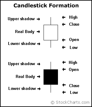
Candlesticks are formed using the open, high, low and close. Without opening prices, candlestick charts are impossible to draw. If the close is above the open, then a hollow candlestick (usually displayed as white) is drawn. If the close is below the open, then a filled candlestick (usually displayed as black) is drawn. The hollow or filled portion of the candlestick is called the body (also referred to as the “real body”). The long thin lines above and below the body represent the high/low range and are called shadows (also referred to as wicks and tails). The high is marked by the top of the upper shadow and the low by the bottom of the lower shadow.
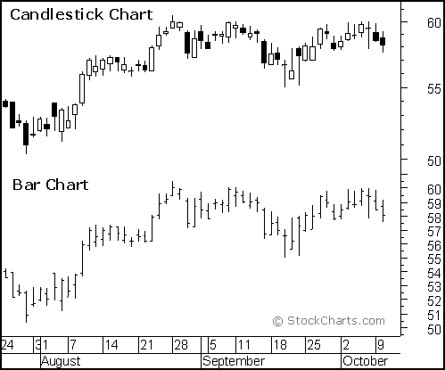
Compared to traditional bar charts, many traders consider candlestick charts more visually appealing and easier to interpret. Each candlestick provides an easy-to-decipher picture of price action. Immediately a trader can see compare the relationship between the open and close as well as the high and low. The relationship between the open and close is considered vital information and forms the essence of candlesticks. White candlesticks, where the close is greater than the open, indicate buying pressure. Black candlesticks, where the close is less than the open, indicate selling pressure.
Long VS Short Bodies
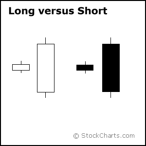
Generally speaking, the longer the body is, the more intense the buying or selling pressure. Conversely, short candlesticks indicate little price movement and represent consolidation.
Long white candlesticks show strong buying pressure. The longer the white candlestick is, the further the close is above the open. This indicates that prices advanced significantly from open to close and buyers were aggressive. While long white candlesticks are generally bullish, much depends on their position within the broader technical picture. After extended declines, long white candlesticks can mark a potential turning point or support level. If buying gets too aggressive after a long advance, it can lead to excessive bullishness.
Long black candlesticks show strong selling pressure. The longer the black candlestick is, the further the close is below the open. This indicates that prices declined significantly from the open and sellers were aggressive. After a long advance, a long black candlestick can foreshadow a turning point or mark a future resistance level. After a long decline a long black candlestick can indicate panic or capitulation.
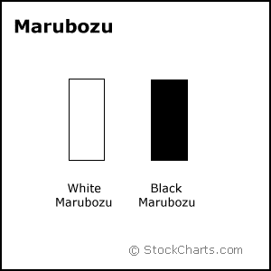
Even more potent long candlesticks are the Marubozu brothers, Black and White. Marubozu do not have upper or lower shadows and the high and low are represented by the open or close. A White Marubozu forms when the open equals the low and the close equals the high. This indicates that buyers controlled the price action from the first trade to the last trade. Black Marubozu form when the open equals the high and the close equals the low. This indicates that sellers controlled the price action from the first trade to the last trade.
Long VS Short Shadows
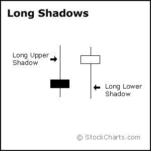
The upper and lower shadows on candlesticks can provide valuable information about the trading session. Upper shadows represent the session high and lower shadows the session low. Candlesticks with short shadows indicate that most of the trading action was confined near the open and close. Candlestick with long shadows show that traded extended well past the open and close.
Candlesticks with a long upper shadow and short lower shadow indicate that buyers dominated during the session and bid prices higher. However, sellers later forced prices down off of their highs and the weak close created a long upper shadow. Conversely, candlesticks with long lower shadows and short upper shadows indicate that sellers dominated during the session and drove prices lower. However, buyers later resurfaced to bid prices higher by the end of the session and the strong close created a long lower shadow.
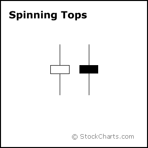
Candlesticks with a long upper shadow, long lower shadow and small real bodies are called spinning tops. One long shadow represents a reversal of sorts; spinning tops represent indecision. The small real body (whether hollow or filled) shows little movement from open to close, and the shadows indicate that both bulls and bears were active during the session. Even though the session opened and closed with little change, prices moved significantly higher and lower in the mean time. Neither buyers nor sellers could gain the upper hand and the result was a standoff. After a long advance or long white candlestick, a spinning top indicates weakness among the bulls and a potential change or interruption in trend. After a long decline or long black candlestick, a spinning top indicates weakness among the bears and a potential change or interruption in trend.
Written by Arthur Hill
